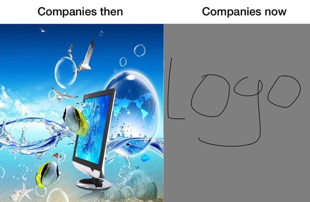
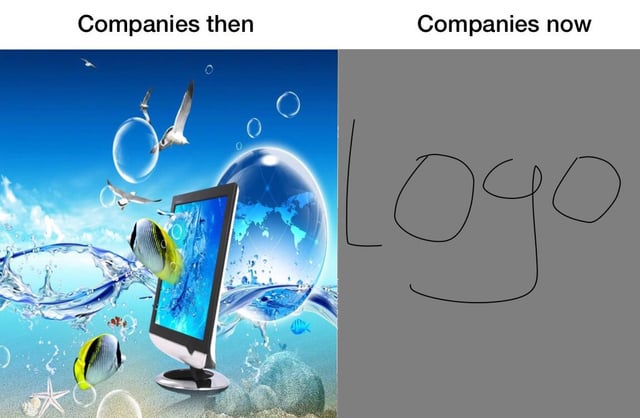
Companies then vs now branding comparison meme
Overview
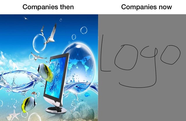
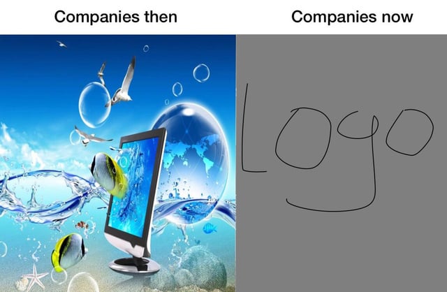
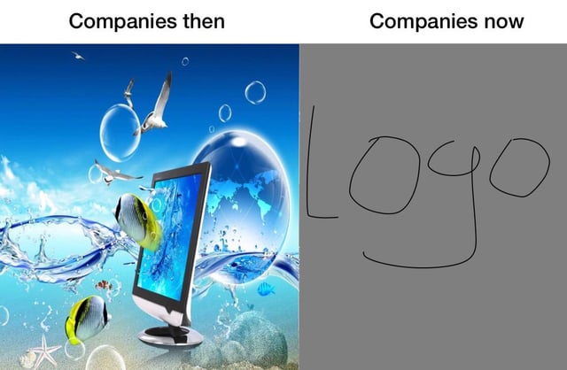
This is a two-panel comparative meme mocking changes in corporate design trends. The left panel, labeled 'Companies then', displays a highly elaborate, maximalist early 2000s-style graphic featuring a desktop monitor, tropical fish, seagulls, water splashes, glossy transparent bubbles, a stylized globe, and a bright blue sky background, representing the overly complex, flashy branding companies used in previous decades. The right panel, labeled 'Companies now', shows a plain solid grey background with a very simple, crudely hand-drawn scrawl of the word 'LOGO', satirizing the current widespread trend of overly minimal, uncreative, generic corporate branding.
Origin notes
This meme was posted to the Reddit r/Meme subreddit, under the original post title 'What happened to this sub?'. It leverages a common two-panel comparison format to joke about the well-documented shift in corporate graphic design from maximalist, highly detailed aesthetics to extreme minimalism over the past 20 years.