EU vs USA

Text content
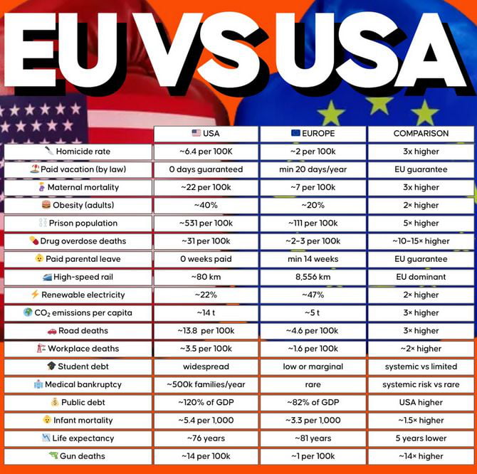
Comparison chart showing statistical metrics: Homicide rate (USA ~6.4 vs Europe ~2 per 100K, 3x higher); Paid vacation (USA 0 days vs Europe min 20 days/year, EU guarantee); Maternal mortality (USA ~22 vs Europe ~7 per 100K, 3x higher); Obesity (USA ~40% vs Europe ~20%, 2x higher); Prison population (USA ~531 vs Europe ~11 per 100K, 5x higher); Drug overdose deaths (USA ~31 vs Europe ~2-3 per 100K, ~10-15x higher); Paid parental leave (USA 0 weeks vs Europe min 8 weeks, EU guarantee); High-speed rail (USA ~80 km vs Europe ~15,546 km, EU dominant); Renewable electricity (USA ~22% vs Europe ~47%, 2x higher); CO2 emissions per capita (USA ~14 t vs Europe ~5 t, 3x higher); Road deaths (USA ~13.8 vs Europe ~4.6 per 100K, 3x higher); Workplace deaths (USA ~3.5 vs Europe ~1.6 per 100K, ~2x higher); Student debt (USA widespread vs Europe low/marginal); Medical bankruptcy (USA ~500K families/year vs Europe rare); Public debt (USA ~120% vs Europe ~82% of GDP, USA higher); Infant mortality (USA ~5.4 vs Europe ~3.3 per 1,000, ~1.5x higher); Life expectancy (USA ~76 vs Europe ~81 years, 5 years lower); Gun deaths (USA ~14 vs Europe ~1 per 100K, ~14x higher)
Overview
A comparison chart titled 'EU vs USA' displaying various statistical metrics comparing the United States and Europe (EU). The chart is structured in a tabular format with three columns: 'USA', 'EUROPE', and 'COMPARISON'. Categories include homicide rate, paid vacation, maternal mortality, obesity, prison population, drug overdose deaths, paid parental leave, high-speed rail, renewable electricity, CO2 emissions per capita, road deaths, workplace deaths, student debt, medical bankruptcy, public debt, infant mortality, life expectancy, and gun deaths. Each row provides numerical values for the USA and Europe, with the 'Comparison' column summarizing differences (e.g., '3x higher', 'EU guarantee'). The header features partial USA and EU flags against an orange background, with bold 'EU VS USA' text at the top.
Origin notes
The image is a user-created comparison chart originally published on the social media platform 9Gag, as indicated by the source information. It presents statistical data comparing social, health, economic, and environmental metrics between the United States and Europe, formatted in a visually structured tabular layout with flag graphics and color-coded columns for clarity.


