Bar Chart Asking For TV Show/Movie That Is Great But Not Popular
Dialogue
Overview
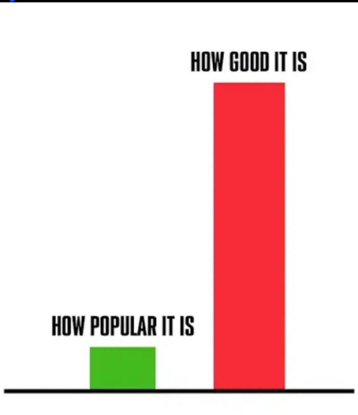
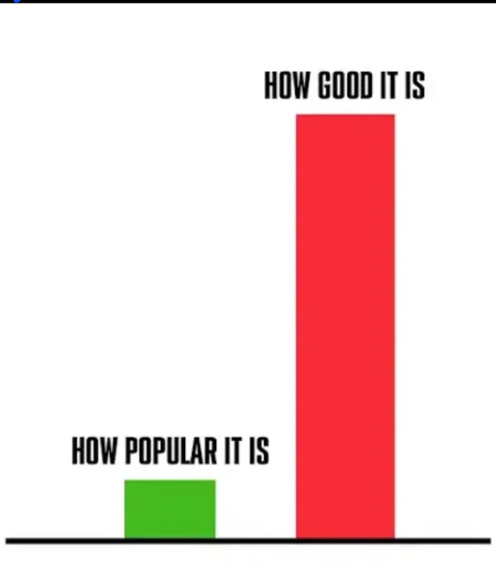
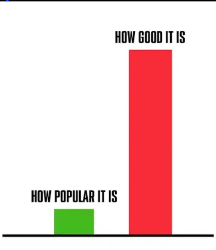
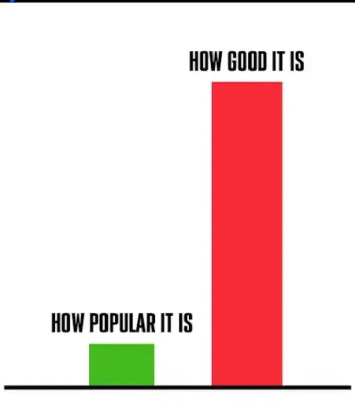
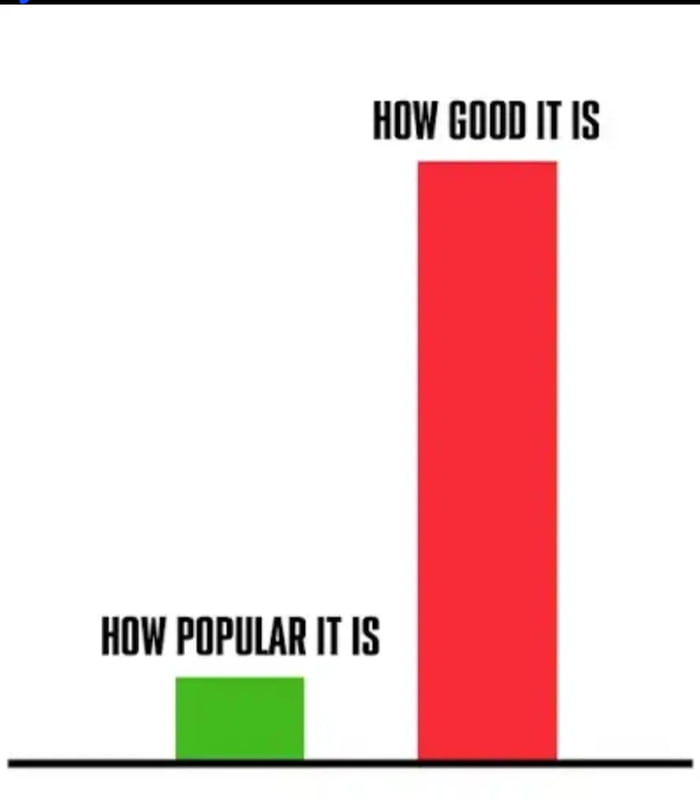
The image displays a simple two-bar bar chart on a white background. A very short green bar is labeled 'HOW POPULAR IT IS', while an extremely tall red bar is labeled 'HOW GOOD IT IS', visually representing a massive disparity where something is of very high quality but has very little mainstream popularity. The meme is paired with a question asking users to name a TV show or movie that fits this described trend.
Origin notes
This meme originates from a 9Gag RSS feed post, with the original post title asking viewers to identify what TV show or movie matches the pictured metric of being far higher quality than its popularity level suggests. It uses a widely circulated bar chart comparison meme template that is commonly used online to highlight underrated or underappreciated items across different categories.