Microsoft Logo Parody: 'Microslop'
Text content
Microslop
Overview
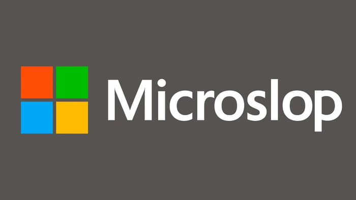
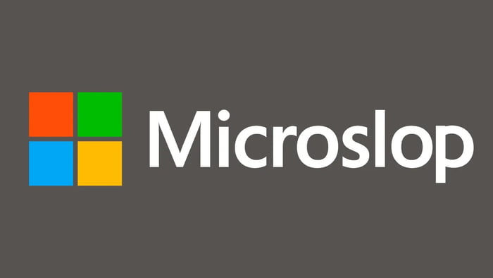
The image features a satirical modification of the Microsoft logo. Set against a plain gray background, the left side displays the iconic Microsoft four-color square emblem (red top-left, green top-right, blue bottom-left, yellow bottom-right). To the right of the logo, the text 'Microslop' is rendered in a white, sans-serif font closely resembling Microsoft's official typeface, replacing the original 'Microsoft' text. The humor stems from the pun on 'slop' (meaning messy or low-quality) substituting 'soft' (from 'software'), implicitly mocking perceived poor quality or unreliability of Microsoft products.
Origin notes
This content originates from 9Gag, a platform known for user-generated memes and humor. It is a remix of Microsoft's official logo, created by altering the brand name text using image editing software (e.g., Photoshop or GIMP). The modification retains the original logo's color scheme and layout while changing the text to 'Microslop' for satirical effect, reflecting common meme culture practices of brand parody.