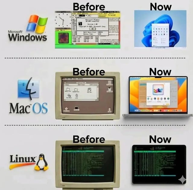
Winamp UI Still Better Than Modern Apps Meme

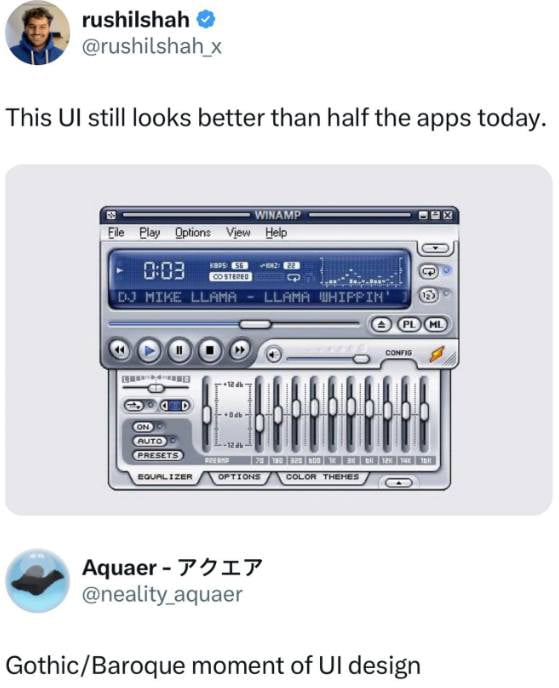
Gothic/Baroque moment of UI design
Text content
This UI still looks better than half the apps today.
Overview
A screenshot of a Twitter/X post by user @rushilshah_x featuring a comparison between the classic Winamp media player UI and modern app interfaces. The tweet text reads, 'This UI still looks better than half the apps today.' Below the text is an image of the Winamp interface, which includes a blue digital display showing '0:03' playtime, the track 'DJ MIKE LLAMA - LLAMA WHIPPIN'', and various controls (play, pause, equalizer sliders, and theme options). A reply from user @neality.aquaer is visible below the image, stating 'Gothic/Baroque moment of UI design,' commenting on Winamp's ornate and detailed interface design.
Origin notes
The image originates from a Twitter/X post by user @rushilshah_x. It combines a screenshot of the classic Winamp media player (a popular audio player developed by Nullsoft in the late 1990s) with the user's commentary. The Winamp interface shown is a recreation or original screenshot of the software, highlighting its customizable, feature-rich design. The post circulates as nostalgic commentary critiquing modern app UI simplicity by praising Winamp's retro complexity.


