IQ vs Socioeconomic Status Scatterplot (Danish Military Test Data)
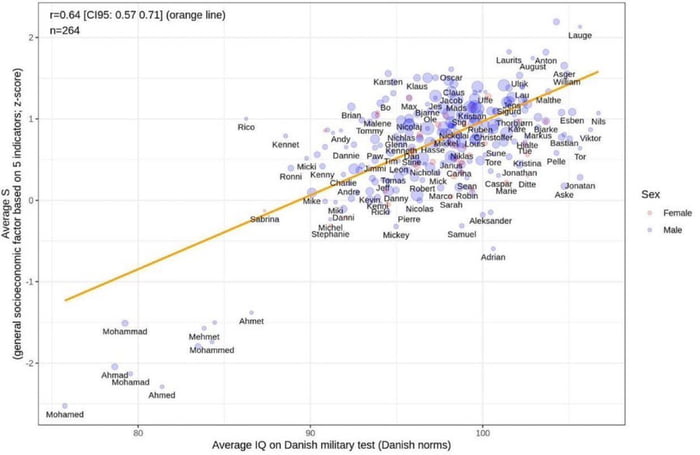
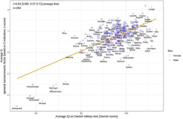
![This image is a scatter plot statistical visualization that examines the relationship between average IQ scores (measured via a Danish military test, using Danish population norms, plotted on the horizontal x-axis) and a general socioeconomic status factor score (an average z-score calculated from 5 socioeconomic indicators, plotted on the vertical y-axis). A positive correlation is shown via an orange regression line, with a stated correlation coefficient `r=0.64` (95% confidence interval: `[0.57, 0.71]`) and a sample size of `n=264`. Each data point is labeled with an individual's name, and color-coded by sex: light pink points represent females, purple points represent males. Data clusters along the regression line, with notable extremes: names like *Mohamed*, *Ahmed* cluster at the bottom-left (low IQ, low socioeconomic status), while names like *Lauge*, *Laurits* cluster at the top-right (high IQ, high socioeconomic status).](https://gagbase.com/i/c/memes/49/cf/af/34/49cfaf34cede6ebc267a9d7f15554e6a.jpg.webp)
Text content
r=0.64 [CI95: 0.57 0.71] (orange line)
n=264
Average IQ on Danish military test (Danish norms)
Average S (general socioeconomic factor based on 5 indicators; z-score)
Sex: Female (light pink), Male (purple)
Overview
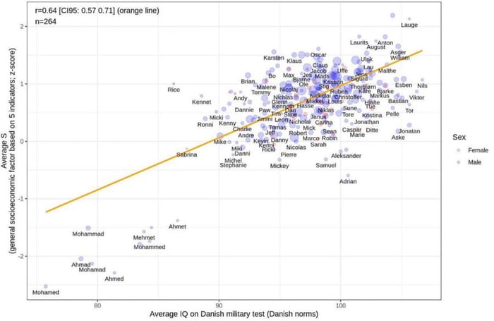
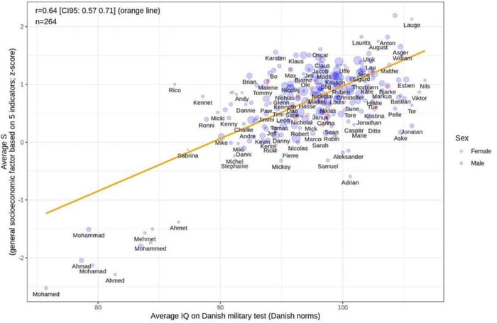
This image is a scatter plot statistical visualization that examines the relationship between average IQ scores (measured via a Danish military test, using Danish population norms, plotted on the horizontal x-axis) and a general socioeconomic status factor score (an average z-score calculated from 5 socioeconomic indicators, plotted on the vertical y-axis). A positive correlation is shown via an orange regression line, with a stated correlation coefficient r=0.64 (95% confidence interval: [0.57, 0.71]) and a sample size of n=264. Each data point is labeled with an individual's name, and color-coded by sex: light pink points represent females, purple points represent males. Data clusters along the regression line, with notable extremes: names like Mohamed, Ahmed cluster at the bottom-left (low IQ, low socioeconomic status), while names like Lauge, Laurits cluster at the top-right (high IQ, high socioeconomic status).
Origin notes
This visualization appears to originate from an academic or data analysis context, likely using data from Danish military recruitment testing (a common source for population-level IQ and demographic data in Denmark). It is a standard statistical plot, likely created with data visualization tools such as R (with ggplot2) or Python (Matplotlib/Seaborn). The image may have been shared on data-focused social media platforms like Reddit's r/dataisbeautiful, academic forums, or in research publications discussing the relationship between cognitive ability and socioeconomic outcomes. There are no visible watermarks or repost indicators, so it is likely an original visualization from a research or data analysis project.